
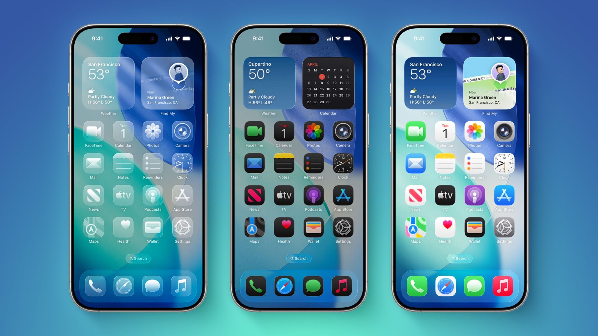
How to Adjust Transparency in iOS 26’s New ‘Liquid Glass’ Interface
iOS 26 introduces a major visual redesign called ‘Liquid Glass,’ emphasizing transparency across user interface elements. While the new look is intended to create a more immersive and dynamic experience, some users may find the high level of translucency affects readability and usability. Apple has addressed this by offering an accessibility feature called ‘Reduce Transparency’ under the ‘Display and Text Size’ section in Accessibility settings. When activated, this option darkens translucent UI elements like the Control Center and app folders, improving contrast without entirely removing the new aesthetic. Users can also assign this feature to their Accessibility Shortcuts for quicker access. Although ‘Reduce Transparency’ does not revert the design to pre-iOS 26 styles or fully eliminate transparency, it serves as a useful compromise for those needing visual clarity. Apple is still in the early stages of beta testing and plans to refine the Liquid Glass look before the public launch. Feedback from developers has already raised concerns about low contrast and readability, suggesting that adjustments may be forthcoming. iOS 26 is currently limited to developers, with a public beta scheduled for July and full release expected in September.